In the fall of 2013, my colleagues and I kicked off a year-long process of research, strategy, design, and development for the redesign and rebuild of the Franklin & Marshall website, designed chiefly for prospective students. This led to the creation of an emotionally engaging web presence for the college, as well as huge learning experiences and enhancements to our own CMS, Apostrophe.

Here are some of the directions that guided our approach:
Design for the right audience.
Throughout the course of the project, our team along with the stakeholders at Franklin & Marshall used the question “How will this work for a prospective student?” to guide each of our decisions and directions—returning to it as a metric of success from research to the launch of the website. To reinforce this, we created a physical reminder of the prospective students in the form of a “prospective student”playing card, which we distributed to our project stakeholders to take back to their office as a reminder of our common goal.

Design for identity and unity.
One of the difficulties of designing for any large organization or academic institution is allowing each of the departments and offices to represent themselves in an authentic and unique way while still giving users a consistent experience throughout the website. Additionally, recognizing many visitors to the website will not enter through the homepage, we wanted to make sure that each section of the website stood on its own. To address this, our team of designers came up with a flexible system of pages that allowed departments and offices to create a unique identity through consistent content across their pages.

Create a sense of being there.
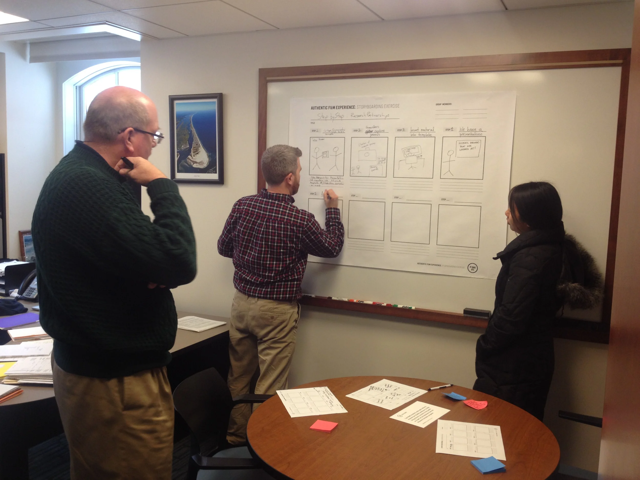
Somewhere between the campus tour and trudging through a foot of fresh snow to our workshop, our research team began to uncover a kind of authentic experience that students at F&M all seemed to have—the unique first-year houses, the Common Hour on campus each week, the culture of research collaboration between students and faculty, to name a few. All of these added up to a rich experience that made the difference for students choosing Franklin & Marshall. We knew that conveying this experience through the website was crucial. One branch of this strategy called for using photography which gave the viewer a sense of participation in a particular scene, making the user feel as if they were a part of the experience that the site was conveying.


Empower your partners.
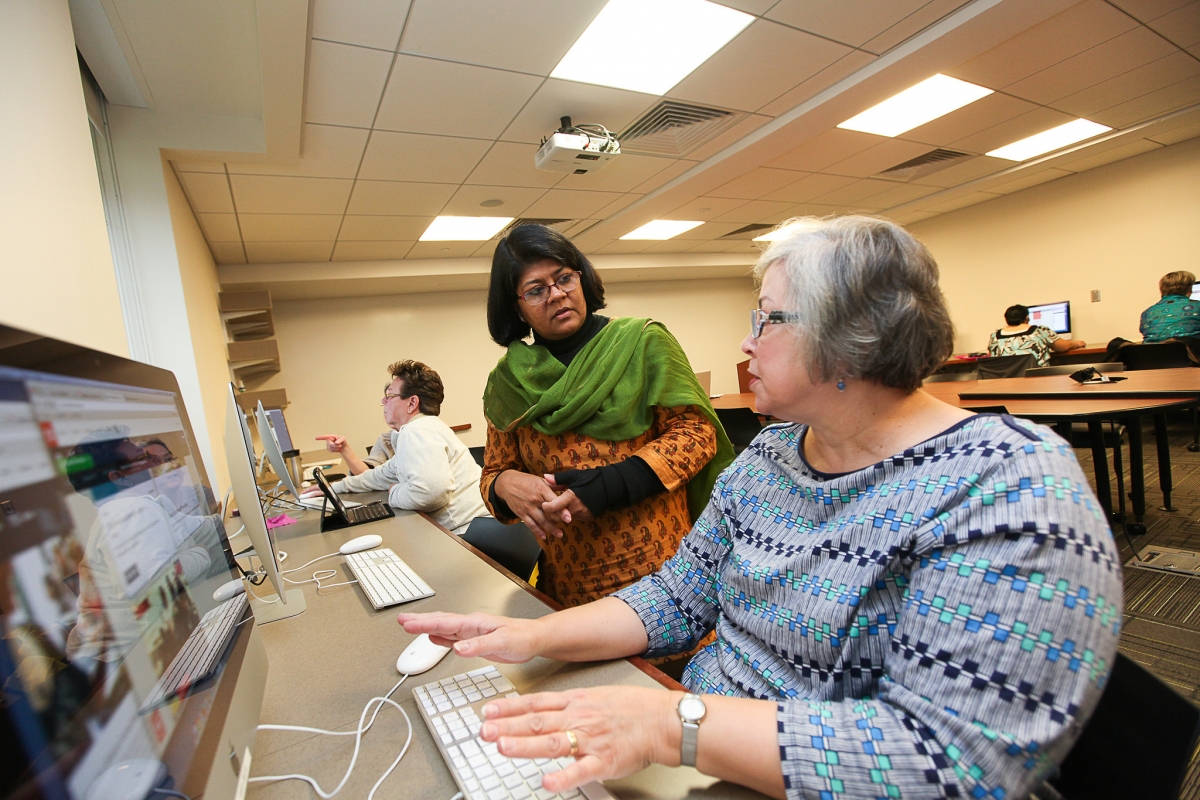
Knowing that we had a large pool of content implementers (F&M faculty and staff), we knew partnering with the communications and technology teams at F&M would be crucial for disseminating strategy and training users on our CMS, Apostrophe. To do that, we ran initial strategy and training sessions with their teams and later, members of our team supported sessions where they became the facilitators and trainers. Empowering them to own the strategy and technology was crucial to ensuring a consistent content and design strategy across such a wide pool of CMS users.